
VUE Maps at Except
by Eva Gladek
Introduction
At Except, we use VUE almost every day; because of its simplicity, we have found it to be the most useful tool available for quickly making system maps and causal loop diagrams.
Using VUE
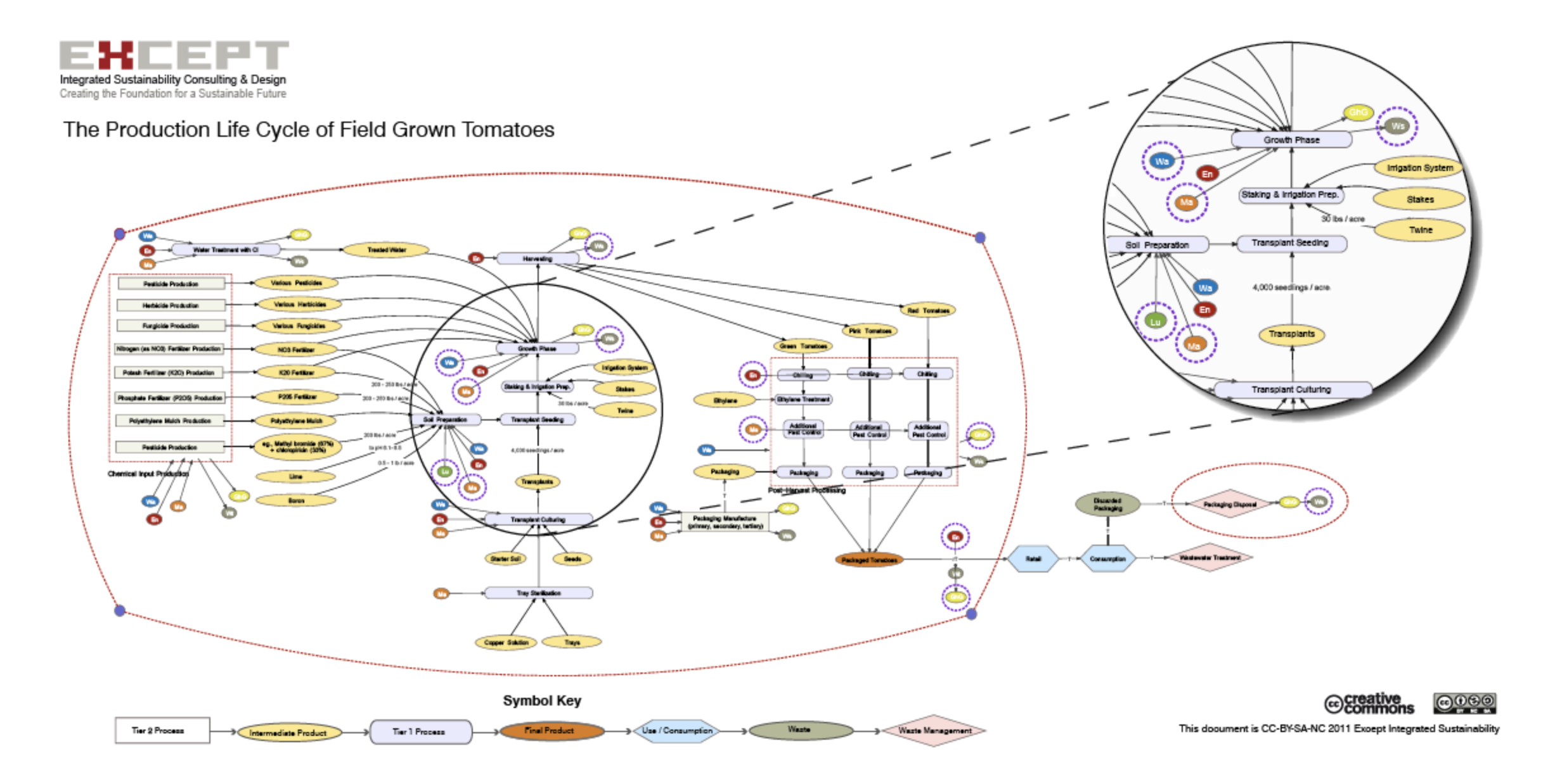
The two maps shown here are an example of how we use the program. They show simplified life cycle production chains. One is for the field production of tomatoes, the other shows the life cycle of beef and dairy production. The maps use different colors and shapes to represent upstream processes (grey squares), immediate products (yellow ovals), primary processes (lavender ovals), and final products (orange ovals). At each stage we have also indicated the major categories of impact entering and leaving the system (energy use, water use, greenhouse gas emissions, land use, waste generation, etc.). These impact categories are represented by the smaller colored circles.
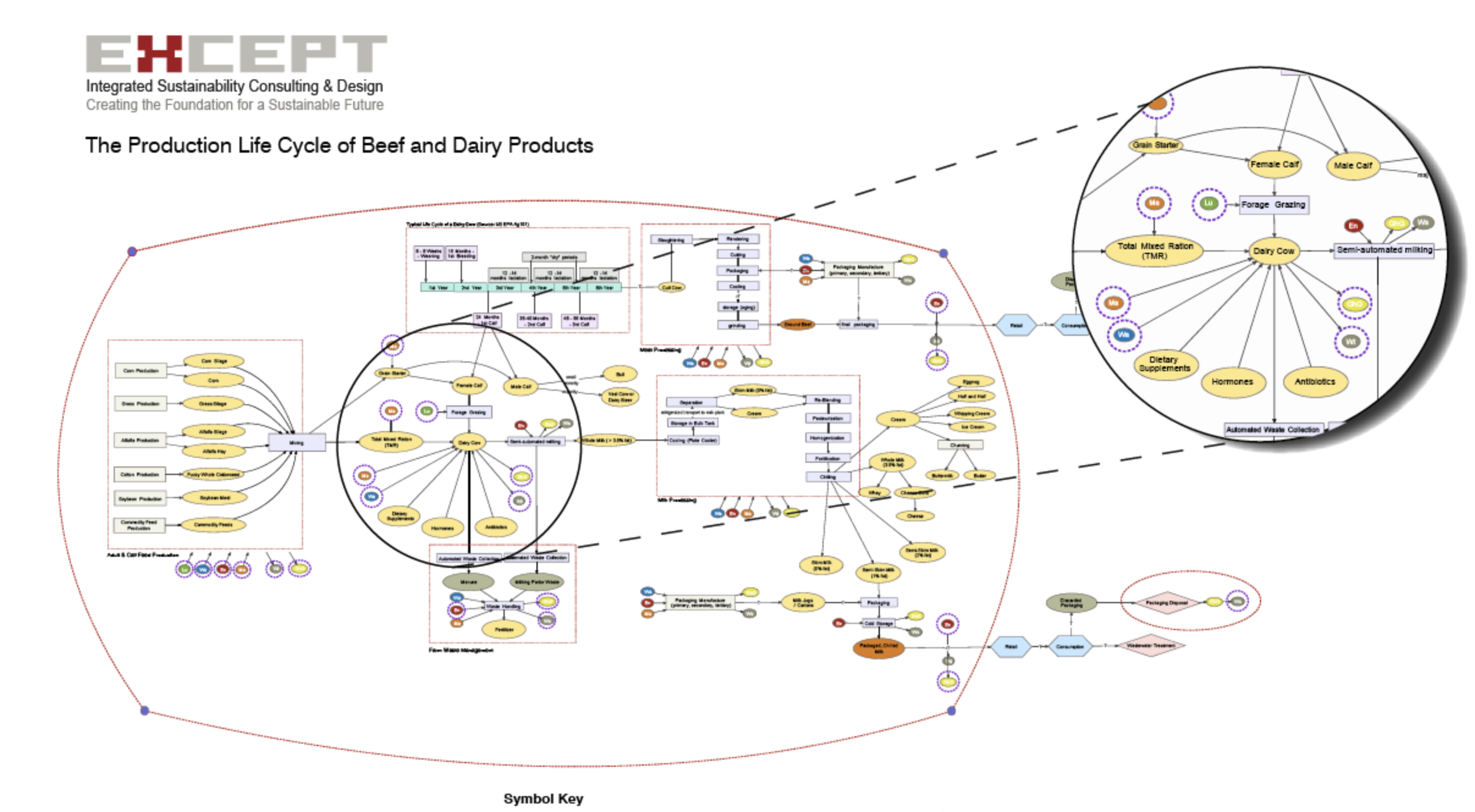
Creating Extensive Charts
To make this graphic, we used VUE's standard features: nodes, links, and layers. To create a frame around the main part of the process diagram, we also used very small nodes as connectors (the small purple dots in the corners of the red frame) to create a free-form shape. This also created a frame that is not ³active,² meaning that objects can be moved into and out of it without getting embedded within a node.
Additional Applications of VUE
We sometimes export VUE maps as PDFs and modify their colors and aesthetics in a vector editing software. That was not done in the case of these examples, but it can be useful when trying to make uniform graphics for a report.
All of our work is Creative Commons BY-SA-NC licensed, so as long as you credit Except, you are free to reuse it. Visit our website for a closer look at what we do: www.except.nl.
Except is a team of researchers, consultants and designers who focus on topics relating to sustainability and the world around us. They do work in a variety of areas, including business strategy, policy, architecture and research.